Andrew Geller, quixotic American architect and designer, passed away on Christmas Day, 2011. He was a good friend and inspiration to many. Beach Houses: Andrew Geller, the book I published about him in 2003 went out of print and became quite difficult to find. It is now being re-issued in paperback by Princeton Architectural Press (March 2014). The following is a memorial piece I wrote upon Geller’s death and some selected passages from the book.

Pearlroth House, Westhampton Beach
I couldn’t believe my eyes when I first saw his houses on the beaches of Long Island, especially the Pearlroth House rising over the dunes of Westhampton Beach: twin boxes tilted on point with a candy-striped chimney in between–he called it the “square brassiere” or “double box kite.” Then there was the Hunt House in Fire Island, a single box on point, raised on locust posts.

Study for Hunt House
It was 1986, the peak of Post-Modernist delerium, and I was preparing a book and exhibition on the forgotten modernist architects of Long Island. I despised the neo-shingle style with its faux Palladian windows and Victorian gazebos that was flooding the market at that point. Robert Motherwell’s house and studio in East Hampton, the only extant work in America by Pierre Chareau, had just been heinously demolished to make way for an “Adirondack-style” MacMansion. The idea was therefore to prove that Long Island, just as much as southern California, had been a crucial breeding ground for modern design by highlighting as many examples as I could find and show how these houses needed to be protected by preservationists and local legislators. I was hoping for maybe a dozen to twenty good examples but the more I dug the more I uncovered forgotten works by William Muschenheim, Marcel Breuer, Peter Blake, Philip Johnson, Alexander Knox, George Nelson, Gordon Bunshaft, Robert Rosenberg, Paul Lester Weiner, Julian and Barbara Neski, and others. It was one thing to discover houses by word of mouth or snooping down winter lanes hoping to catch a glimpse of a cantilevered porch, flat roof or floor-to-ceiling window peaking out behind a privet hedge, but it was even harder to find original archival material–drawings, photographs, scale models–that I would be able to use in an exhibition.
Someone had mentioned Geller’s name but I thought they meant Abe Geller, another architect who’d also designed houses on Long Island, so I was late in realizing the misunderstanding and finally drove out to Northport in October 1986 to meet Andrew for the first time. His wife Shirley greeted me at the door and said, “He’s been waiting for you,” with a twinkle in her eye and I found him sitting there in the living room of his Victorian house surrounded by hundreds of sketches, plans, perspective renderings and beautifully crafted models. He’d saved everything he’d ever done and it felt as if I’d finally hit the mother lode.

Frank House, Fire Island
When the Long Island Modern show opened in 1987, Robert Stern criticized me for including Geller’s work. It wasn’t part of the accepted canon. He was an outsider, wasn’t properly trained, was more of an industrial designer, illustrator, etc. Peter Blake accused him of stealing his idea for the Pinwheel House, which was nonsense, but a certain amount of resentment must have been stirred up by the fact that Geller’s work had been published in mainstream, high-circulation magazines like Life, Sports Illustrated, and Esquire, the publication where Geller published his “Esquire Weekend House,” an ingenious little box on stilts that could be dismantled and towed behind a bachelor’s sports car. In fact, this had been the source of Blake’s feigned outrage. He even wrote a blistering letter to the editors who thought it amusing and pinned it to their bulletin board.

Esquire Weekend House
As far as I know, Geller’s houses were never published in “professional” magazines like Architectural Record and certainly not Architectural Forum while Blake was Editor-in-Chief. Geller posed something of a threat to the status quo. He was incredibly prolific, experimental, friendly, never took himself too seriously, could be irreverent, and even had dared to live a normal family life in suburban Long Island. He was successful in his own right, well outside the inner sanctum of the design world. He wasn’t practiced in the priestly double-speak of the architectural establishment. He didn’t care. He had the nerve to be playful, make jokes, have fun, be funny, breezy, light, even joyful. He’d made up his own rules and didn’t care much what the mainstream thought of him. During the week he slaved away for Raymond Loewy who knew a good thing when he saw one and kept Geller cranking out shopping centers and department stores. But there were weekends and Geller, who never seemed to rest, found his own kind of clients and worked during his free time designing simple but experimental little houses that were low budget and low maintenance. Indeed, these works defined a transitional period of American domestic architecture that lay somewhere between the flat-roofed, glass pavilions of neo-Bauhaus (Bunshaft, early Johnson, Blake, et al) and a younger generation of sixties neo-Cubist, neo-Corb modernism as recycled by Gwathmey, Meier and the New York Five.
Sure, he was sometimes uneven, but so was Picasso. Geller could be an irritant, a speck of sand in the establishment’s eye. They were hoping he would just fly away, dissappear somehow, but he didn’t. His freshness and originality kept popping up again and again, being “rediscovered,” until he was able to claim his own level of noteriety and acclaim. In the end, America prefers the mythology of the outsider: Melville, Thoreau, Woody Guthrie, Kerouac (who also lived in Northport,) Jackson Pollock, James Dean, etc. and I predict that as Geller’s work becomes better known it will find its place within the canon of American originals–architects such as Bruce Goff, John Lautner, Paolo Soleri, Mark Mills, Mickey Muennig, E. Fay Jones–all of them outsiders and in this regard it’s fortunate that grandson Jake Gorst has perpetuated Geller’s legacy through his tireless archiving, documentary film-making and preservation efforts.
Andy will be greatly missed by all of his family, friends and admirers. He was a sweet and loving man of many talents. May he rest in peace.

July 23, 2002, Amagansett, NY: It’s a hot Friday in July and we’ve been driving in circles through the sandy sprawl of Amagansett, somewhere between the primary ocean dunes and the Montauk Highway, where weekend houses are plunked on tiny lots cheek by jowl. Andrew Geller, quixotic designer/architect, is our guide as we go in search of the innovative beach houses he designed in the 1950s and 1960s. Geller, 80, is at the wheel of his vintage canary-yellow Mercedes, dressed elegant-shabby in a seersucker jacket and English sandals. His white beard and thick mustache are brushed neatly into place.
We are looking for one of his early creations; few survive in pristine condition. Most have either been torn down to make way for bigger houses, or remodeled beyond recognition. A few were washed away by hurricanes. It begins to seem like a lost cause. He designed five or six beach houses in this area but we can’t find any of them. There was the Eileen Hunt House, the Green House and the Strick House, but they seem to have vanished. We drive past many new houses, too big for their tiny lots, swollen with additions and odd assortments of neo-classical detailing.

Geller pauses and stares at one house with an eccentrically angled roof. Was it the De Monterice house that he designed in the early 1960s, the one with the “cow catcher elevation” and flaring walls? “No,” he says, “That must have been torn down too,” as we turn down another narrow lane. In a sense we are looking for a lost period of civilization, a period of innocent expectation, a time of family beach picnics, cole slaw, outdoor showers and bunk beds, before real estate prices skyrocketed, before the traffic was unbearable, and before the architecture became so predictably pretentious. It was also a time before strict zoning, set-backs, or the emergence of environmental consciousness—when houses could still be designed to burrow into the side of a dune or hover over wetlands.
Over the past twenty years, however, the fields and dunes of this area have filled up with so many trophy McMansions, intended to evoke status, arrival and gentility. They are designed in the same ham-fisted collusion of past and present: the historic pastiche of Palladian windows, dormers and gambrel roofs combined with high tech security cameras, and computerized irrigation systems, all of it high cost and high maintenance, in one of the oddest ironies of the age. Money acquired in nano-seconds of good fortune gets neatly aged through so many expressions of 19th century capitalism.
“Bigger,” says Geller, “is not always better. Most of these new houses are ridiculously oversized for their lots, too close together,” he says with conviction. “A thousand square foot house is what belongs on a 100-by-100 foot lot, but now they’re squeezing in three- and four-thousand-square-foot houses that have no relationship between the house and the property. What they’re creating is an instant slum.” He waved his hand at some of the oversized intruders and explained his theory of the minimal footprint: “You should only use 20 percent of the building lot,” he said, “but within that area be as unpredictable as possible.”
We have double backed, driven in a circle, gone down a series of roads with cute, beachy names like Dune Way and Treasure Island Drive. Geller is a bit confused. It’s been a while since his last visit here and there are so many new houses. Getting back to the recent past is never as easy as you think. “It’s here somewhere,” Geller reassures me, but we’ve driven down a cul-de-sac that was only finished a few years ago. As we double back again, Geller cranes his neck to see behind a promising clump of Russian Olive, but no, it’s another one of those mini Palladian manors.
Despite the development, these streets and dunes are filled with pleasant memories for Geller. He tells me about a house that he designed for a professor at Columbia University: Schlacter or was it Schacter? He’s positive the house is along here somewhere, not far from the Green House, with two monolithic pavilions connected by a second story bridge. The bridge supported a dining room that hovered high above the property to catch ocean views. It was in this setting that Geller met Benny Goodman. “Goodman was sitting quietly all though the lunch party,” recalled Geller. “After dessert he began to whistle a catchy tune. Everyone at the table stopped and stared at the famous band leader, who finished his tune and said ‘Now I’ve given you a Benny Goodman concert in return for being in your marvelous house.’”
Geller never quite fit in with the architectural mainstream. He followed his instincts—a “wild man with a T-square,” as one publication characterized him. His weekend houses had more to do with personal lifestyle than architectural theory. But even if some criticized them for being gimmicky, his best houses captured the exuberance of the period. They were little dream houses that inspired self expression and personal freedom. His clients loved them. Geller never belonged to any design clique, nor does he resort to the pedantic language that so many architects use. When he describes his work he tends to speak elliptically or in sweeping generalities. He has made a career rebelling against conventional house forms, attacking both the traditional pitched roof pile as well as the flat-roofed modernist box: “unsquaring the cube,” as one journalist wrote, subverting it in every imaginable way by tilting it on edge, skewing it, or crushing it altogether. Geller’s mission, as he saw it, was to liberate the American vacation house.
A certain mistrust and contempt for authority was bred in Geller during his earliest years. “The day I was born,” he said “my father was in jail doing time for his political activism. In those days, everyone who wasn’t Anglican was considered a bed-wetting Commie red.” The day of Geller’s birth was 17 April 1924. His parents had emigrated to the United States from Russia in 1905 and settled in Brooklyn. His father, Joseph Boris Geller, was from Odessa; his mother, Olga, from Kiev. Joseph was a socialist and an accomplished artist, who, during the depression years, painted large commercial signs on the sides of buildings. (Among other commissions, Joseph Geller designed the logo for the Boar’s Head company, still in use today.) “I was in awe of him,” said Geller. “I used to think he was God. He was huge, over six foot two with broad shoulders, red hair, and these big square hands that were twice the size of mine.” One early image left a particularly deep impression on the young boy. It was the sight of his father standing high on scaffolding, painting a sign on the wall of the Brooklyn Paramount Theater. To this day it remains a vivid memory. “I wanted to be like him,” said Geller, “larger than life.” Joseph Geller owned a frame shop on Rockaway Avenue in Brooklyn and Andrew learned to draw and paint while sitting at his feet. Every Sunday his father would take him on sketching trips out to the flatlands of Brooklyn. “He told me that you had to draw all the time—to study people, their movements, buildings, streets—and he repeatedly told me to ‘look and see,’ which meant to pay close attention to everything. This was the only way to understand it,” he said. “My father loved nature and felt that the only way to interpret it was honestly.”
Geller began to display talent in his early teens. He later attended art classes at the Brooklyn Museum and studied at the High School of Art and Music. He entered Cooper Union and studied architecture with Esmond Shaw and Samuel Paul. (Shaw was architect of the Central Park Zoo. Paul designed apartment buildings around New York City.) He also studied life drawing with Robert Gwathmey, the father of architect Charles Gwathmey.
Geller’s studies were soon interrupted by World War II, and while he volunteered at the first possible opportunity, his experiences in the Army further eroded his faith in the established order. During his basic training he was among a group of soldiers accidentally exposed to a toxic chemical agent while on maneuvers in Louisiana. The recruits were ordered to don gas masks and move through a contaminated house. Geller wore a faulty mask, and as a result, suffered life-long medical consequences. To this day he can’t expose his body to direct sunlight, a cruel irony for a man who designs beach houses.
In 1943, while still recuperating at an Army hospital in Texas, Geller read an article in Life magazine that profiled the work of Raymond Loewy, the famous industrial designer. The article explained how Loewy had streamlined American product design, and showed illustrations of some of his projects. Loewy excelled at a new kind of commercial packaging and his best known designs were exercises in the synthesis of form, starting with his first big commission, the redesign of the Gestetner duplicating machine in 1929. This was followed by a series of streamlined successes that included a pencil sharpener in the shape of a rocket ship, the S1 locomotive for the Pennsylvania Railroad, a newly styled Greyhound bus, a bullet-shaped car for Studebaker, the Electrolux vacuum cleaner, as well as the logo and packaging for Shell Oil and Lucky Strike cigarettes.

Geller was fascinated by the way Loewy combined so many different disciplines: “He designed everything from toothpicks to shopping centers,” said Geller who decided that this was the kind of work he wanted to do. One day in 1946, he went over to Loewy’s offices at Five Hundred Fifth Avenue, across from the Public Library, and applied for a job. He was hired and then mysteriously fired that same day. (Later he would learn that a disgruntled supervisor had done it as a cruel joke.) But he was called back a few weeks later, and was given a full-time position. He stayed with the company until 1974. At first he was put on product design and worked on smaller products like the housing for a 35mm camera called the Anscoflex (1954). Geller also developed the prototype for a new kind of photo enlarging system. There was something in this photographic interest that would carry through his architectural work, and, for that matter, the work of his contemporaries. Photography and modernist architecture were parallel themes in the postwar world of American leisure. As one architecture journal reported in 1955: “Most vacation houses are designed to work, roughly, like a camera: a box, glazed on one side, with the glass wall pointed at the view.” With its squarish lens and sliding aluminum shield, the Anscoflex bore an uncanny resemblance to many of the beach houses that Geller would design later in his career. One can’t help but see traces of such a camera in his original plan for the de Monterice House, for example, in which a lens-like window directs the boxy house toward the ocean view.
 Later in his tenure at Loewy, Geller graduated to architectural projects and specialized in designing department stores. These buildings, which were often located in suburban shopping centers, tended to take the form of overblown modernist boxes with eye-catching logos emblazoned across sleek facades. Geller’s job was to make the buildings stand out amid the sprawl of parking lots. At the Lord & Taylor store in Garden City, Long Island (1956) a broad set of travertine steps lead beneath a canvas awning and pointed like a directional sign towards the main entry. The name of the store was written boldly across the white brick facade in a hand-scripted style. For Hengerer’s department store in Amherst, Long Island (1957) Geller used a similar combination of materials and graphics: a scripted logo above a wall of glass and ceramic tiles.
The goal of the modern industrial designer was to contain a variety of different parts within a single envelope, to create a product that was instantly recognizable and desirable to the consumer. The idea of the container was the guiding principle in all of Loewy’s work. The goal was to create the sleekest impression and the most memorable visual impact. This was accomplished through streamlining, a smooth and shiny overdressing derived from airplane design, that made use of sweeping, aerodynamic lines, tapered edges and teardrop forms. He reworked and repackaged old fashioned looking brands by paring down and consolidating divergent elements, giving shape to a new world of product development, marketing, logo-making and advertising. This was the mind-set within which Andrew Geller worked for twenty-eight years as a chief designer and vice president in the Loewy Corporation. Within that period, he would apply those principles on everything large and small, from camera bodies to shopping centers.

Study for Lynn House
During the 1950s, Geller began to strike out on his own and take commissions outside of the Loewy office. It was a break from the corporate pressures of his day job and a way to make extra income. “Designing homes like this offers a release for me from my everyday work,” he said at the time. In 1955 he began to produce a series of eccentrically free-form and eye-grabbing vacation houses that were fun, structurally daring, and challenged the status quo. These “summer-use playhouses,” as he liked to call them, provided the opportunity to express himself and try out his own ideas. While Geller had designed a few earlier residendial projects, his 1957 beach house for Elizabeth Reese was the first real breakthrough and marked the beginning of this new career. The design concept was determined by a combination of forces: limited funds, weather conditions, and the owner’s unpredictable lifestyle. Beginning with the impossibly small budget of $5,000, Geller used every trick and technique available to bring the house in for roughly $7,000, only $2,000 over the original budget. He was particularly concerned about the risks of building a house right on a stretch of beach that was known to flood. Geller perched the house on the highest part of the dune above a foundation of locust posts that had been driven 10 feet into the sand. His theory was that the sloping walls of the A-frame would be “storm proof”– less resistant to hurricane winds. That was the idea anyway; it also happened to be the cheapest way to build a roof. Complaints from the local building department were countered with the explanation that the unusual shape of the house was derived from local potato barns.

Reese House
The strongest influence on the design was the personality of Reese herself, a strong willed, independent career woman who knew exactly what she wanted—intimate contact with the sea and sand and instant release from her busy schedule in the city. Reese was the director of public relations at the Loewy office and knew Geller from work. She went about inventing her own style of life at the beach. The sleek and simple lines of the house captured something of her independent spirit and dynamic lifestyle.

Betty Reese Fishing
The house was a wood-frame construction with cedar shingles on the roof and board-and-batten-siding on the walls. A 5-foot-wide “widow’s walk” was cantilevered precariously along the ocean side. Cross-bracing for this deck was painted white to distinguish it within the overall composition, like the cross stroke in the letter A. The upper deck provided a place for naked sunbathing and quiet meditation. It also helped to break the intensity of the afternoon sun, acting as a visor over the southern wall of glass. Inside, the timber framing was left exposed. There was no central heating or insulation. In winter, the house was boarded over with plywood.

The living room measured only 13 by 22 feet but it felt much bigger, as it opened out onto the deck and dunes. A free-standing fireplace had windows on either side for watching the sunset. Upstairs was Reese’s own bedroom, reachable only by a ladder that could be retracted with a system of pulleys and counterweights. This private little perch provided escape from weekend guests while maximizing space. Larry Vita, Reese’s contractor, came up with some of his own ideas during the building process. At the time, Vita was marketing his own concept in leisure living, the “Surfside 6 Floating Home,” which came with a hole in the living room floor so that tenants could fish while watching television. Novelty in domestic architecture was the prevailing spirit of the day.

Interior Reese House
When it was all finished, Reese made sure to call on her editor friends to see that the house and its architect got the recognition they deserved. John Callahan, a reporter for the New York Times visited and wrote a story, “Summertime Living Becomes even Easier at New Long Island Beach Cottage,” about the house in the Times’s real estate section. This, and future articles, would bring a level of recognition that Geller had never known while working anonymously at the Loewy office. A week after Callahan’s article appeared, a stream of cars drove down Daniels Lane hoping to get a closer look at the unique beach house. Leonard Frisbie, a Wall Street broker read the story and immediately commissioned Geller to design a similar house in Amagansett. Soon Geller found himself with a new career.
 In less than three years, between 1958 and 1961, Geller completed more than fifteen new houses, all in his spare time. It was a break-through period and his head never stopped spinning as he rushed from one project to the next, still managing to keep regular hours at his day job in Manhattan. “In those days I only required five hours of sleep,” said Geller. “Three A.M. was the best time to be at the drafting table and the music was always good on WQXR. I remember starting out east in Montauk at 5 AM, working on one house, then driving all the way into the city to work at Lowey’s studio, then, after five, I would drive down to the Jersey shore where I was designing another beach house. I didn’t know if I was coming or going.”
On first impression, Geller’s little beach houses of the 1950s and 60s may seem like caricatures, but they represented a kind of everyman modernism that was accessible to people with lower incomes. “Most of [Geller’s] clients live in the cube of a Manhattan apartment, work in the cube of a Manhattan office and feel liberated in the new definitions of space around them,” wrote Fred Smith in Sports Illustrated. “All of them want a maximum square footage for a minimum investment.”[11] Geller understood his clients. In many ways their needs were the same as his own. They were not rich but had ambition. They were often as not veterans of World War II, had children, and considered themselves politically progressive with a modern sensibility, an interest in art, and a willingness to explore new lifestyles.
This was a time when thousands of Americans were enjoying the prosperity of the postwar economy and finding that, even with modest incomes, they could afford a vacation house of their own. Geller’s little escape pods offered release from city pressures. They also helped to take the mind off the H-Bomb and the looming prospect of nuclear annihilation.
Geller became passionately involved in the design/build process and often remained in contact with his clients long after construction was completed. Many came back for bigger houses as their families expanded and they needed more space. A good number became life-long friends. One was so pleased that she wrote a concrete poem of thanks that took the form of her boxlike house, with a stack of repeated words: “I love my house, I love my house…”
Each of Geller’s houses was like a portrait, a custom-made tribute to its owners’ personalities. This could sometimes take an absurdly literal form: Irwin Hunt, the manufacturer of cardboard boxes, got a box turned on edge. Victor Lynn, an executive at Kodak, got a box with lenslike windows. In some cases, the metaphors could be more lurid, as with the Pearlroth house in West Hampton Beach (1959). In lieu of a precise methodology, Geller relied on instinct, something closer to surfing—a sport gaining popularity at the time—rather than formal analysis. A good surfer caught a wave and improvised his movements according to the set and curl of each break. Geller drew his inspiration from the site and the personality of each client—making up the next move as he went along. Intuition played a key role in the process. He listened carefully and tried to remain open to new possibilities—always willing to change directions in mid-stream, never stuck within a single mindset.
He would usually work out the rough form of a new house in a series of fast sketches. This was similar to the process he followed in the Loewy office, where a signature gesture was employed to embody the spirit of each new product. Cumulatively, these sketches chart an explosion of ideas, a new vocabulary generated by the special conditions of beachfront living. It was during this period of frenetic output that he designed some of his most inventive houses. In early studies for Elizabeth Reese’s beach house in Sagaponack, NY (1955), Geller had drawn a conventional modernist pavilion with a flat roof and glass walls. Reese wasn’t thrilled by it and told him as much. (Perhaps it looked a bit too much like one of the shopping centers he was designing for Raymond Loewy.) So, right there in front of her, he conjured up an A-frame structure, drawn roughly on a scrap of paper, that would be cheaper to build than a glass pavilion. Reese approved and they went ahead with the project.
Once Geller had achieved a desired logo-like shape (A-frame, box-kite, whatever) he would tinker with it, tilting or rotating, bending or possibly even splitting it, as he did with the Levinson House (Surf City, New Jersey, 1958). This action created two separate shed-roofed structures that were attached at the hip. With the Lynn House (Westhampton Beach, 1961), Geller subverted the generic modernist box by squashing it and breaking it open at the four corners.

Lynn House
Geller did his best work within a narrow set of budgetary and material restrictions. His houses were built simply and economically using the least expensive materials available—materials that could be found at any local lumber yard. Most cost less than $10,000, or under $12 per square foot. He figured out ways to keep the structures small, inexpensive and low maintenance. They had single-layer skins, no insulation, and exposed structures. There were no frills, but Geller made up for this with ingenuity. “These houses are for play,” he said at the time, “so you can do fun things with them.” When Geller broke away from the spartan formula the results weren’t always so convincing. A case in point, was the Levinson House, built for the relatively extravagant sum of $20,000. It was designed with all the ingredients necessary for year-round use, hence its comparatively high price. But hindrances such as insulation, furnaces and ductwork only seemed to cramp Geller’s style. Compared to his other beach follies, the Levinson house appeared somewhat heavy-handed and suburban. With a full masonry foundation, it was anchored to the ground rather than hovering above it.

Lynn House Interior
There was, in fact, considerable method to his madness. Focus on water views determined how the houses were sited and where windows were placed. Prevailing wind directions and the angle of the sun were important considerations in siting and determining placement of decks and windows. Freestanding fireplaces with centrally placed smokestacks were used for chilly nights but also for compositional harmony as vertical counterpoints to horizontal rooflines. Each house, no matter how small or inexpensive, was given its own signature components: catwalks, cantilevered platforms, lookout towers, oddly shaped doors and windows, spiral staircases, Rube Goldberg contraptions for lowering ladders or raising counters. Houses were connected to their natural setting through floor-to-ceiling glass walls as well as walkways and sun decks that straddled the dunes. A master of organizational detail, Geller knew how to take advantage of every square inch of space. Furnishings were kept as minimal as possible. Often he designed simple built-in pieces—couches, beds, shelving systems—made from plumbing pipes and plywood. Within the limited format of the small, inexpensive beach house, Geller was able to find himself as an architect. He employed space saving devices such as multi-level bunk beds, fold-up staircases, built-in couches and showers that could do double service from both inside and outside. He also mastered the art of finding extra storage and sleeping areas in leftover nooks and crannies. He thought of different ways to accommodate short-term, seasonal use with hatches and barn-like doors to protect houses during storms and winter months. These were attached by hinges, sliding tracks or other devices for easy opening and closing. Houses had the most minimal plumbing so that water pipes could be easily drained come fall.
As soon as they were finished, each house was christened with a pet name like the “Box Kite,” “Milk Carton,” or “Grasshopper.” It should be remembered that Geller was working during a period when modern American architecture was playing an increasingly metaphoric role, selling itself as something other than just building. This was true with Eero Saarinen’s birdlike TWA terminal at Idelwild Airport of 1961, (a building that Geller admired) and Wallace Harrison’s fish-shaped church (the “Holy Mackeral”) in Stamford, Connecticut . Both were popular examples of contemporary American architecture. Anthropomorphic and zoomorphhic allusion helped to soften the perceived coldness of modernism, making it more accessible to an otherwise hesitant public. Attaching a pet name, whether for an air terminal or a beach house, took away some of the jitters.

Meanwhile, as Geller found himself receiving more commissions, his free-form houses were getting more attention in the press. They made photogenic subjects and were the caption writer’s delight: “Far-Out Buildings in the Sun,” “Zigzag by the Sea,” “In Shape for Summer,” etc. During this period, Geller houses appeared frequently in popular publications like Life, Holiday, Esquire, and Sports Illustrated. Two years after he had published the Reese house in the Times, John Callahan published another article in the New York Times that described Geller’s latest batch of inventive beach houses, including the Pearlroth, Hunt, and Langman houses. Geller was on a roll.

Langman House, (Reese House in Background)
Doctor and Beverly Langman were among those who had seen Calahan’s first article in the Times. They bought a lot just to the east of Reese’s and asked Geller to design something similar. Langman was a prominent physician who had served as Joseph Kennedy’s family doctor. (He delivered several Kennedys including baby John Fitzerald, the future president.) The Langman’s had no children themselves but wanted something whimsical for their summer getaway. As he always did, Geller made a little scale model out of cardboard and balsa wood. It had an eccentric tower in the spirit of a lighthouse and a wrap-around deck. The Langmans were delighted and agreed to go ahead with construction of the house, which ended up costing $11,500.

Langman House
Geller’s first response was to provide privacy between the Reese and Langman houses as they were only 400 feet apart. “I wanted Betty Reese to look at something nice,” said Geller who left the west side of the Langman’s tower blank. Four shuttered hatches were used to break up the monotony of that side and further emphasize the quirky nautical theme. The 20-foot high octagonal tower had inwards sloping walls and contained five rooms. A crow’s nest on the roof that could be reached by an external ladder. The ground floor contained a living room with a rustic stone fireplace. Large glass panels were strategically placed to provide the best ocean views. An adjoining, single-story wing had a kitchen and bathroom. This section had four oddly pointed windows, sort of modern gothic, on the ocean side with canted walls to the north and south. The Langmans fell in love with their house. It was a quirky, light-hearted place to enjoy their weekends. As one magazine put it: “The whole world assumes an exciting perspective when viewed from an octagonal tower mounted on a deck in a sea of sand.” But the gods of weather would conspire against such summer bliss. In March 1962, a violent storm blew out of the northeast and washed away both the Langman and the Reese houses.
In 1958 Geller made his biggest splash of all. This time however, it was not in the Hamptons but on Fire Island, the long narrow sandbar that skirts Long Island’s southern shore. If he had been flirting in the stratosphere of architectural convention with the Reese and Langman houses, Geller went into orbit with the house he designed for Irwin and Joyce Hunt, by far his boldest creation to date. A strict set of setback regulations had limited the area that Geller was allowed to work with, but with a bit of cunning, he turned this restriction into an advantage. He learned that he was only required to submit a first floor plan, without elevations, to get a building permit. He presented what looked like a conventional plan, a long narrow rectangle, and the building department gave its approval. But in three dimensions, the house was a wild concoction that appeared to be an elongated box turned on edge. (In time it would be dubbed the Box-Kite or Milk Carton house) The building authorities had no idea that it would end up being such a controversial structure. The unusual shape of the house was also a response to the region’s history of hurricanes. Geller had a theory that you could protect the house by turning it into an aerodynamic object with its leading edge pointed toward the ocean so that gail force winds would blow under and over its sloping walls.

Hunt House, Fire Island
Geller managed to fit enough sleeping area into the Hunt’s house for eight people, including two built-in sofa beds in the living room. A single bathroom served the entire household, crammed in beside the tiny kitchen, though the shower could also be reached from the outside deck. People coming up from the beach were able to rinse off sand and salt without tramping through the house. The ground floor had an open living/dining area. A master bedroom on the second floor was reached by a collapsible staircase that could be folded into the ceiling when not in use, another space-saving device. The upper level opened onto two different balconies, one overlooking the ocean, the other the bay. Metal rods held lidlike awnings in place. These could be lowered at the end of the season or in the event of a storm.
Two tiny bunkrooms were ingeniously squeezed into either end of the house. While the main reason for these diamond-shaped spaces was effect—to maintain the “Box kite” illusion—the practical purpose for the ends being tipped was to provide as much headroom as possible for the cramped quarters. Each contained a complex arrangement with two bunk beds, one on the lower level running east to west, the other on an upper level that ran north to south. Shelves and closet spaces were ingeniously concealed in the remaining recesses. Triangular portholes provided ventilation.

Hunt House Interior
The completion of the Hunt House marked a significant moment of emergence—a moment when Geller discovered a signature style. He had succeeded in transforming a domestic space into an abstract sculptural object, almost as if it were one of the commercial containers he had packaged for the Loewy studio. While it may have appeared completely detached from earthly necessity, the house never failed to carry out its role as a family retreat. Whoever lived in this container would find happiness. The Hunt House made a significant impression in the press. It was featured in Life magazine on 3 August 1958 as part of a special, eight-page spread on the boom in American vacation homes, alongside a “cigar box” house in Water Mill, NY and a hexagonal house in the Catskills. “In the expanding U.S. economy owning a second home may become almost as common as the second car,” read the article. “One distinguishing feature of these houses is their uninhibited design. When it is a holiday house, even conservative families accept unusual forms—and they are pleased if their house has a playful air like….the odd looking milk carton house on the page following.” And there was a photograph of Irwin and Joyce Hunt playing with their baby in front of the topsy-turvy house. The same issue of Life contained Cold War updates on Cuba and the famous “Kitchen Debate” in Moscow between Nikon and Khrushchev.

Kitchen Debate, Moscow
The success of the Hunt house brought Geller even more commissions. It also raised the level of performance anxiety as he felt pressure to be more inventive with every new commission. How could he possibly top his last effort? The designs became more and more extreme as he pushed the limits of what one could do with limited means and an excess of imagination, or as one writer put it: “how far a little plywood and a lot of guts will take you.” This was certainly the case with his next project, the Pearlroth House, built in Westhampton Beach in 1959.
 Eastern Long Island had seen its share of shipwrecks, beached whales, smugglers and even a U-boat landing by Nazi Spies during World War II, but the area had never seen anything quite like the Pearlroth House. It is hard to measure the impression this structure made as it was being built during the winter of 1958. In part an elaboration and continuation of the Hunt geometries, it was even more audacious in conception and execution. This time, Geller began with two elongated box shapes and rotated them in tandem so they were perched on point, not unlike the diamond-shaped silhouette of Hunt, but in a more prominent way. He then filled the void between these two sections with a glassed-in living area.

Study for Pearlroth House Interior
Arthur Pearlroth was an executive for New York’s Port Authority, but had a reputation as a lady’s man. “He was a romantic macho guy who wore a bikini bathing suit where everything showed,” says Geller. Again, the architect supplied an ironic architectural pun, in this case a “square brassiere,” as he called it, for a man known to collect erotica. Once the initial shapes were established, the challenge was to fit the necessary functions into such a sculptural entity while providing a modicum of privacy for the clients. Long low benches were built along the side walls of the living area that could also be used as guest beds. Steps lead from the benches up into the diamond-shaped pods that contained the bedrooms—similar in arrangement to the double bunk system he used at the Hunt House. Geller was able to squeeze three bunkrooms and a bathroom on the upper level of each pod and provide an additional 75-square-feet of storage space within the angular recesses of the house. A space age staircase lead precariously from the dunes up to one of the pods and entered directly into the house’s only bathroom for showers after swimming.

Pearlroth Interior
Pearlroth’s diamond pods were frequently referred to in the press as giant spectacles or binoculars. In his own explanation, Geller spoke of these twin forms “telescoping out,” virtually leering at the object of desire, which, in this case, was the water view. The transparency of the house was a form of exhibitionism; activities inside could be seen from both the beach and the road, inviting the gaze of strangers and peeping toms. The libidinous reading could be pushed even further to include the phallic, candy-striped chimney stack rising from the center of the house with testicular pods bulging on either side. The Pearlroth House proved to be one of Geller’s most successful and published houses. A number of future clients requested exact copies, but Geller made a point not to repeat himself.

Rudolph “Rudy” Frank was a German émigré who managed an ice cream company in Astoria, Queens, and was the inventor of something called “Diced Cream.” His wife, Trudy, was a free-lance fashion illustrator and artist. They lived in New York and went out to Fire Island on the weekends. They had also had seen John Callahan’s article in the Times about the Reese House and asked Geller do design a house. They were not convinced by Geller’s first proposal, and asked him to rework it. The Frank’s had gone on vacation to Mexico and visited the Mayan ruins at Uxmal and Chichen Itza. They fell in love with the ancient stones and showed Geller their snapshots of the temples and the great stepped pyramid. “Andy looked and listened to all this—he’s a good listener,” recalled Rudy Frank. Inspired by the ruins, perhaps, Geller came up with something thoroughly modern but with ancient undertones in its battered, inward-sloping walls. “A month later he came back with this design,” said Frank. “We didn’t have to make a single change.” The seemingly incongruous link between Mayan temples and Twentieth Century beach houses may have seemed arbitrary, but both are dedicated to the worship of the sun in one form or another.

Frank House, Fire Island
The Frank House was built on top of one of the highest sand hills along the beach, floating amid the stunted pines and with panoramic views of both the Atlantic Ocean and the Great South Bay. There were wide decks on three sides of the house; Geller included a catwalk that crossed the open living area and penetrated the all-glass facade. It then cantilevered 12 feet out from the front of the house like a pulpit. Trudy Frank would often lie there and take sun baths. The Franks rented their house out one summer and later learned that it had been used for the making of a gay porn film called Boys in the Sand, which apparently became a classic of the genre.

Frank House
Geller also designed most of the furnishings for the Frank House, including couches and beds that were made out of stock plumbing pipes and lumber. “Andy quoted me a price of $14,850 and when the house was finished it came in at exactly the amount he had quoted–To the dollar,” said Frank. The only problem was a spiral staircase that lead from the living room up to the master bedroom. There weren’t any prefabricated spiral staircases on the market yet and it proved to be something of a struggle to build the thing from scratch. The Frank House was featured in a full-page spread in the 7 July 1961 issue of Life magazine.

Frank House
In his next project, Geller made a significant daparture from the eccentric geometries of the Hunt and Pearlroth houses. He designed the Leonard Jossel house for an ocean front site in Davis Park, Fire Island. The house, which could be described as a large open studio loft, was built in 1960 on top of a primary dune. The client was a graphic designer and artist who wanted a place to paint ot the beach. He admired the simplicity of Shaker design and wanted his house to be as spare as possible. “The idea was to get every room facing the ocean,” said Geller, “So I came up with this elongated rectangular structure that rode the crest of the dune.” (Because of its low pitched roof and simple, boxy form, Geller referred to it as the “Monopoly House.”) The ocean facade was mostly glass. Infill walls were painted black. The end walls were white. The house could only be reached by a narrow, elevated boardwalk but it made a striking impression, drifting among the dunes of Davis Park. Interiors were spartan, with exposed studs and plywood walls. It couldn’t have been simpler. An open living/dining space filled one half the length of the house and rose its full height to the ceiling. A wood-burning stove sat in one corner and Jossel’s abstract canvases hung on the rudimentary walls. The other half of the house was reserved for Jossel’s studio upstairs, and two ground floor bedrooms. A small deck cantilevered off the second floor studio and a ladder staircase lead down to a more expansive deck. Barn-like doors could be closed to protect the house against storms and winter weather.

Jossel House
Sometime in 1963, about the time of President Kennedy’s assassination, Geller began to develop a new approach to design. While still exuberant, the architecture feels more anxious, more defensive. Basic forms become fractured, their surfaces multifaceted or incised with flaps, fins, and slits. If early successes like Hunt and Pearlroth were basic geometries that Geller toyed with like children’s blocks, then this next phase was characterized by how he treated, or acted upon those forms. No longer Euclidean acrobatics, the houses were now objects that the architect modified by a proscribed set of verbs: cut, fold, split, incise. Outer walls appeared to be folded back like flaps of skin, an action which was compared, by some, to the art of Japanese paper folding. “Call it an origami house, with its slashed openings and jutting fins,” wrote one magazine. Windows and doors were punched out, often in sharp, triangular incisions—what his friend and client Betty Reese, called “beer can openings.”
This angular kind of window treatment became part of Geller’s signature style during the 1960s. In 1969, the journalist Franklin Whitehouse wrote a feature story describing them in the New York Times: “As a means of checking the weather or saving on light bills, windows are fine, but they’re even better if they twist, protrude and look like sculpture fixed to the sides of houses,” he wrote.

Elkin House
Geller’s interest in slicing and dicing—what might be called his X-Acto period—began with a few tentative moves but evolved into a distinctive new style. Beginning with the George, Levitas, and second Reese houses, all built in 1963, it reaches full expression in the Elkin (1966) and Strick (1968) houses. There had been early hints of this new direction in earlier projects, such as the Lynn House fenestration. The openings in this case weren’t truly “cut,” however, but rather created when the walls of a cube were forced outward, as if compressed from above by a heavy hand. This implied action created diamond shaped lenses at all four corners.
The true surgical incision first appears in an unbuilt project for Paul and Merle de Monterice (1960). The 1,118 square foot house had a basic shoe-box shape that measured 22 by 30 feet. The linear progression began on a wooden ramp that led up from the sand and passed through a facade that looked like a giant keyhole with a flaring front door and a large Cyclops window staring out from the second floor. Triangular flaps of shingled wall protruded on either side of the main entrance in a gesture that Geller called a “cow catcher facade.”

After entering the house’s mysterious portal, one walked past two tiny bedrooms, the kitchen and a bathroom and into a two-story living area that rose up to a gently peaked roof. The focal point of this space was the fireplace, positioned centrally like a sacrificial altar. On either side were broad glass panels extending the full height of the house and looking out, beyond the fireplace, toward the ocean. (As at Betty Reese’s house in Sagaponack, the idea was to simultaneously catch ocean views while enjoying a fire.) In fact the glass panels on this end of the house were the only openings that offered full frontal scenery. The side windows were long triangular slits that angled off the body of the house. Since it was going to be built in an area of Amagansett that was beginning to suffer from overdevelopment, Geller devised these fin windows to provide light and selected scenery while retaining privacy; views were deflected and directed away from neighboring lots that might have future houses on them.
Renderings of the de Monterice house were published, but the house, as drawn, was never built. Local authorities felt the design was too radical and advised the clients and architect to conform more closely to local building traditions. Geller went back and drew up a second, more “traditionalized” set of plans that were eventually approved. The final version of the de Monterice house was built in 1964 although nothing like it was first envisioned. Geller would use many of its concepts however, in future projects.

George House
For the designer Phil George, Geller delivered a truncated version of the Reese A-frame. In this case, however, the side walls were gently curved around a bare bones frame. As with the de Monterice house, Geller used floor-to-ceiling triangular cuts on either side to give views toward the northeast overlooking a potato field. These openings were infilled with amber and mauve panels to filter bright morning sun. The horizontal line of an oversized gutter ran across the front of the house to keep rain from spilling down the expansive front window. This detail and the house’s shape gave it something of a Japanese profile. A miniature replica of the main house was built in the back of the property and served as a weekend guest house.

Strick House, Amagansett
The most extreme example of Geller’s can opener style was a new house for Elizabeth Reese, this one commissioned after the first was destroyed by the northeaster of 1962. This time, Reese chose a safer piece of property, on high ground, well back from the ocean. While it would begin with another variation on the A-frame theme, it would end up being very different. Where the first house had been open to the ocean views, this one was surrounded by oak trees. In response Geller gave it more a more protective feeling—riffing on the shack-in-the-woods aesthetic of Henry David Thoreau. A free-standing stone fireplace sat like a household god at its center point. A catwalk spanned the open rafters above and connected the client’s bedroom to a sleeping platform and sun deck.

Reese House #2
The shape of the structure was rudimentary and inexpensive to build: a flat roof, sloping side walls, a single layer of cedar shakes and exposed framing on the inside. In this case, all of the improvisation went into surface treatment, in particular the architect’s oddball fenestration. “I was trying to get her to love trees,” said Geller, who accentuated different perspectives of the surrounding woods by using eccentrically placed openings on either side of the house. Sharply angled flaps jutted out from the walls, supported by struts and infilled with glass to create prismatic shapes. “I decided to do triangular flaps so you could get views in two directions,” said Geller. From inside the barnlike interior one experienced a sequence of fractured views. Floor-to-ceiling cuts—a variation on the de Monterice windows—rose on either side of the house and illuminated the two-story living area. These vertical slits were also designed to frame the full length of the tallest trees on the outside of the house. Narrow at the bottom, they grew wider as they reached the roof to account for the bushy tree tops. For contrast, Geller inserted a fanlight window at one end of the house that shed light into Reese’s bedroom.

Levitas House
Mike Levitas was a reporter for Time magazine before becoming city editor of the New York Times. He had seen pictures of the Pearlroth house and asked Geller to design something similar for a windy site in GayHead, on the southern end of Martha’s Vineyard. Geller proceeded with preliminary sketches but plans were thwarted when the builder got cold feet. He warned Levitas that such a design would raise eyebrows: “I’m afraid the plan is too radical for me to try, especially so close to the main road,” wrote the contractor in a letter to Levitas. “There is too much feeling about these new houses on the Island, and I would just be asking for trouble, and I think you would too.” The builder didn’t even give a quote. Fearing that he might have trouble securing a mortgage from a local bank, Levitas took heed and asked Geller to retreat back to a more conventional sketch that he had shown Levitas a few months earlier. “It would have been a thrill a minute to live in the Pearlroth House, but I’m sure we’ll get our quiet kicks from living in a house without pointed ceilings,” wrote Levitas to Geller. The end result, which was built in 1963, may have been something of a compromise but it was one that pleased both client and architect.

Levitas House
The shingled surface and sloping lines of the roof planes echoed local building traditions—from a distance one might have even mistaken it for a barn—but up close, it was pure Geller. Oversized versions of his triangular beer can openings projected off the front and sloping sides of the house like seagull wings. The house’s shingle skirt was lifted discretely at either side to reveal horizontal bands of windows and a concrete block foundation. The flap-like windows framed water views and scooped up the breezes. The idea was to catch the prevailing winds. Indeed, the overall theme of the Levitas House was prescribed by the wild and windy conditions of a building site that lay in the middle of an open meadow and overlooked a salt pond and the sea beyond. The house was described as being either a seagull about to take flight, or, as one publication described it, “a kite that has come to rest on the dunes.” This particular reading was underscored by a photograph that showed the Levitas children flying a kite in front of their new house.
 Geller was able to finally incorporate several ideas he had failed to achieve in the de Monterice house, in a five-bedroom house for Louis & Racile Strick (Amagansett, 1968). It’s not hard to see why it came to be known as the Cat House with two pointy skylights that rose on either side like ears and two square cat’s eyes gazing from the front facade. Whiskers were represented by flaring triangular panels that projected out on either side of the front door—the “cow-catcher facade” that Geller had originally drawn for de Monterice.

Levitas Interior
Prototypes for Mass Housing: While Geller continued to delight clients with his one-off experimental houses, he was also working on solutions for the mass housing market. Like other architects and developers of the period, he was eagerly in search of this, the Holy Grail of post-war building: the perfect prototype for an affordable, mass-produced house. Even in his most eccentric, one-off creations, Geller kept his eye on this goal. There was a second home boom going on in America at the time. Construction of vacation houses in the United States had increased dramatically since the 1940s when a second home was still considered the exclusive provenance of a wealthy elite. By the 1960s, however, marketing surveys put the second home inventory at three million plus. Many of the same individuals who had received mortgages on the GI housing bill, could now afford to build a second home far away from the noisy city. “Families have more real income,” explained one building journal, “consequently more discretionary income; financing is easier. There’s more leisure time and better highways to desirable locations.” Builders and developers recognized a lucrative new market among middle class families who might have saved a bit, but not enough to afford a custom-designed vacation home.

In 1958 Esquire magazine commissioned a beach house for swinging bachelors. Geller came up with the “Esquire Weekend House,” a small, portable unit that could be towed to any beach, and erected on stilts for only $3,000. “It does not have room for more than one guest,” read the accompanying text. “Its refrigerator will not hold more than a weekend supply of tonic and soda. However, the Esquire Weekend House has no lawns to mow, no sash to paint, and can be opened for the season in four minutes flat. A ship’s ladder can be drawn up through the house’s trap door in case of prowling wolves or unwanted guests.”
 The Esquire unit was designed in a 6-foot square modular built on four concrete foundation points. The different sections were held together with wire bracing. It could be closed and opened like a box with sliding panels. Each panel was painted in a different primary color. The front panel could be folded down to become a small porch and “shade shelf.” It contained a tiny kitchen unit and a fold-away toilet. A bed roll could be pulled out for sleeping and canvas shades were designed to be pulled up instead of down. There was also a small storage compartment with enough room for “two changes of clothes, a portable typewriter, a hi-fi, and two sets of water skis or surf-casting gear.” The Esquire Weekend House was a reducto ad absurdum version of the post-war weekend aesthetic. But as cartoonish as it was, the proposal contained ideas that Geller would develop in future projects.
The Esquire Weekend House can be seen as an early, albeit tongue-in-cheek, attempt to investigate the possibilities of prefabricated construction. As a kit-of-parts, it was originally designed to be the prototype for an expandable housing system. In a series of unpublished drawings, Geller depicted how the basic Esquire unit could be expanded in the event that the Esquire bachelor suddenly settled down and found himself with a growing family: “If the marital status of the owner changes and more room is required in the house, similar cubicles can be attached to the nucleus of the basic unit, either at ground or crow’s-nest level.” The fully expanded version would have a broad glass facade, its interior divided by a sequence of square panels finished in a variety of different textures and colors. The panels were suspended from a grid of slender steel support columns that resembled the Case Study structures of Pierre Koenig and Craig Ellwood that were being built during the same period in California. If family life began to cramp the Esquire man’s sense of style, there was yet another solution: “when the cluster of contiguous units becomes too populous, [he] can build himself still another unit, separated from the cluster, to recapture his bachelor hood solitude and quiet.” The publication of the Esquire Weekend House caused a minor flap in Esquire’s editorial offices. The architect and critic Peter Blake accused Geller of plagiarism, claiming that the Esquire House was a copy of his own Pin Wheel House, built in Water Mill, New York in 1954. “I am gratefully flattered to see from your May issue that Mr. Andrew Geller likes our house,” wrote Blake to the magazine. “Photographs of the house were in your offices for several weeks; if you later changed your minds in this matter, then it would have seemed only fair to go to the original source of the design-idea, rather than commission someone else to exploit it for you.” In his own defense, Geller scribbled off a humorous note to editor-in-chief Ralph Ginzburg: “I am shocked by Peter Blake’s reaction to our tiny beach capsule. Quite probably I have been affected by every example of architecture I have ever seen, from the Crystal Palace to the late lamented Third Avenue El. There is only so much one can do with $3,000…I can assure you that no plagiarism was intended nor can I honestly relate what I have designed to Mr. Blake’s very handsome and refined Water Mill House.”
Around the same period as the Esquire project, Geller did plans for another prefab beach house also built with a steel frame. He called it the “Minimum House” and it appears to have been intended as a buildable prototype, not just another humorous illustration. The Minimum House was similar to Esquire in plan, with sliding doors on a track frame, but it had a barrel-vaulted roof instead of a flat one.
Leisurama

The suffix “a-rama” was popular in the postwar years, adopted by advertising agencies to give common words an updated, space-age spin—evoking the image of round-the-clock, nonstop fun, as in “Bowl-a-Rama” or “Dance-a-rama.” This was the guiding spirit behind Leisurama, one of the first mass-produced vacation houses in America. As its name implied, it was intended for vacation living—for all out relaxation. It was a house that you didn’t have to sweat over, either in mortgage payments or upkeep—a house that was as comfy and user-friendly as a pair of bowling shoes.
 The Leisurama house was the brainchild of Herbert Sadkin, president of All-State Properties, a development company based on Long Island, New York. Together with Macy’s department store and Raymond Loewy, Sadkin dreamed of making millions by building the next Levittown, a Levittown for leisure, a Levittown with sand. Macy’s would handle the furnishing and marketing and the prototype would be designed by Geller, who, by now, had been promioted to chief architect for Loewy’s housing and home components division. “Sadkin was a real operator,” recalled Geller. “He wanted to emulate the Levitt houses.” While there were a few different styles, the most popular was the simple “Convertible” model, a neat little design in the carefree spirit of America’s mid-century drive-in culture. There was nothing fancy, but the house was perfectly suited for weekends at the beach. It consisted of a simple one-story box built on concrete slab with a low-pitched roof and wide overhangs—something like a Japanese tea house. There were two bedrooms, (a three-bedroom version was also available), a kitchen and living room. Every living room came with a “picture window,” a de rigeur mark of status in mid-century suburbia. Geller designed several variations for the front facades, but the interior lay-our remained essentially the same. The most distinctive design feature was probably the open-air carport that extended from one side of the house. Its outer wall contained a storage unit with shelves and louvered folding doors. A finished house cost approximately $10,000. This included all furnishings and the “spacious” 7,500 square foot lot that it was built on. Payment arrangements couldn’t have been easier. A down payment of only $490 was required for the basic model, followed by monthly payments of $73. For an extra $7.45 per month, you could add an extra bedroom. Anyone with a steady job could contemplate such an investment. An “Expanded Convertible” version was available at a slightly higher price ($940 down and monthly payments of $87.90.)
While the architecture of Leisurama wasn’t particularly ground-breaking, the marketing was aggressive and imaginative, appealing to America’s love of instant gratification. Macy’s decided that the houses could be sold over the counter like laundry detergent or TV sets. In the fall of 1963, a full-page ad appeared in New York newspapers with the rendering of a Leisurama in a beach front setting—seagulls reeling overhead, a sailboat on the bay. The caption read: “If you’ve ever yearned for your own place-away-from-home, but thought it might cost too much or be a chore to find, furnish and buy…you must come to Macy’s. Come soon…and bring the family with you. They’ll be as excited as you are.” Anyone who visited the ninth floor of Macy’s flagship store on Herald Square that month was in for a big surprise. There, plopped among the patio furniture and barbecue equipment, was a full-scale Leisurama house—a vision of domestic ingenuity.
After conducting surveys, the merchandising brains at Macy’s understood that their target clientele might not dare to purchase a vacation home if they also had to buy a whole new set of furnishings. So, it was decided to include everything, and the houses came “ready for your leisure pleasure,” complete with beds, tables, chairs, sofas, rugs, a forty five-piece Melmac dinner service for eight, napkins, bath mats, curtains, towels, pillows, sheets, and blankets-all provided by Macy’s (“…and we don’t have to tell you what this means…”). There were even brightly colored toothbrushes supplied for each member of the family. (If you had five in your family, the house came with five toothbrushes.) All you had to do was pick a building site, order the house and move in a few months later. “No need to shop for furnishings. All you have to do is turn the key in the lock and start living,” read one advertisement.
A prototype version of Leisurama had first been displayed in the Soviet Union during the summer of 1959 when it became a player in Cold War diplomacy. The American National Exhibition was the first cultural exchange between the USA and the USSR since before the Bolshevik Revolution—the idea was to present the best of American culture and display all the rewards of free-market capitalism. All-State Properties were invited to design and construct what was billed as “the typical American house,” one that a middle income citizen could afford. “It was an eye-opener for the Russians who had never seen anything like it,” said architect Geller.
For hundreds of happy consumers back home, Leisurama would become the American dream incarnate. More Leisurama models would be built on Long Island—in the parking lot of Macy’s franchise store at Roosevelt Field and on a traffic circle in the village of Montauk. Hundreds of people waited patiently in line to get a glimpse of the all-inclusive wonders. In keeping with the Cold War mood of the day, tape recorders had been planted in each room of the model homes to secretly eavesdrop on what prospective buyers were saying—what they liked or didn’t like. According to Geller, the most positive remarks were generated by one of the master bedrooms that had been decorated in brothel red and had a mirror mounted on the ceiling above the bed. “The women were thrilled,” said Geller. “‘How marvelous we’ll look lying in that bed,’ they said.” So much for the marketing theories. “They weren’t interested in the kitchen at all,” said Geller.
In the following Summer of 1964, a Leisurama model was built on the grounds of the New York World’s Fair in Flushing Meadows, Queens, attracting more prospective buyers. Several hundred units were built and sold instantly in a Leisurama community built outside of Fort Lauderdale, Florida. “It was called Lauder Hill,” recalled Geller. “But I don’t remember seeing any hill. It was nothing but marshland as far as the eye could see.” But that didn’t seem to matter. “They weren’t very pretty to look at but people rushed out and bought them anyway,” recalled Geller, the architect. “The sales gimmick was the big appeal, I guess.”
“People loved them,” recalled Ed Pospisil a Montauk based contractor who worked for Leisurama. “You walked in, had your bacon and eggs and you were in business.” Two hundred units were built on 1/3-acre plots in the Culloden Point area of Montauk, on the north shore, overlooking Gardiner’s Bay. They cost between $11,000 and $17,000. “Now they’re reselling for more than $300,000,” said Pospisil. One of All-State’s representatives, Frank Tuma, helped to develop and sell Leisurama. “I didn’t have to do much,” he said. All two hundred units in Montauk sold within the first six weeks. “They went like hot cakes,” he said.
For many clients, Leisurama would be the first house they ever owned and were purchased for vacation use, as “getaway houses.” But since the houses came with full insulation and central heating they could be easily adapted for year-round use. (“You may choose to live in it year-round or retire to it.”) Dick Lewis, a photographer for the Daily News, lived in a Leisurama in Montauk for 24 years. He and his family first used it as a summer house, then expanded it and moved out full time when Lewis retired from the newspaper.
When you drive around the Culloden Point development today, there doesn’t appear to be anything out of the ordinary about the mesh of suburban style streets that switch back and forth. It has been almost forty years and the trees and shrubs have grown up and filled in the landscape. Many of the original Leisurama houses have been altered beyond recognition. Doors and window trim have been painted in bright colors; “widow-walk” decks have been added onto roofs to get water views. Some of the little front yards have been personalized with gravel gardens, rope fencing and poodle-style topiary.
It is hard to tell at first, but if you keep looking, and drive a little deeper into the neighborhood, the eye begins to detect a rhythm to the low-pitched rooflines, the picture windows and then, a final giveaway, you notice the succession of carports with little storage units—an unmistakable mark of the Leisurama legacy. Many of the carports have been filled in to create extra room but they are still recognizable.
A handful of the houses are still in pristine condition. It is rumored that one old lady continues to live in the same Leisurama that she bought back in 1963. Supposedly—so goes the story—she has kept all the original furnishings in mint condition: the Leisurama towels, the Macy’s sheets, the forks and Melmac plates. Yes, even one of the original toothbrushes (still in its plastic wrapping.) But this may just be another Leisurama myth. No one seems to remember the old lady’s name, or exactly which house is hers.
Modular concepts that Geller first toyed with in the Esquire and Leisurama projects were developed further in housing schemes for companies like Huber, Kingsberry and Presidential Homes during the 1960s. The Huber Home was something of a continuation of the Leisurama concept, but intended for a year-round, suburban condition. Geller worked on it in collaboration with Donald Huber of the Concept Development Company in Dayton, Ohio and Better Homes & Gardens magazine. With its low-lying profile and broad, gently pitched roof, the Huber Home was modern but not as daring as most of Geller’s designs. The single-story house was divided into symmetrical sections similar to the “bi-polar” houses that Marcel Breuer had introduced to the American suburbs after World War II. It had 1,796 square feet of interior space, a relatively grand spread compared to Geller’s tiny beach houses. The kitchen, living room, dining room, and TV den were on one side of a central breezeway, while the bedrooms were on the other side. A car port and enclosed yard could be transformed into additional rooms as family needs dictated.

Around the same time, Geller was also collaborating with Bill Snaith on the development of something called the “Quiet House.” This model project was designed for a group of companies in Dallas, Texas and intended to demonstrate the significance and marketability of silence in home construction. There was also the all-aluminum “Easy Care Home” which Geller helped to develop for the Aluminum Association of America, but perhaps the most innovative of Geller’s housing schemes, was the “Vacation House System.” (1966–67) This system could be expanded in a kind of crystalline sequence of hexagonal sections sprouting from a core unit that contained living/bedroom, bath, and kitchen. All components would be manufactured in a factory. Wall sections were half glass wherever possible. When needed, additional sections could be delivered to the site by truck and connected with ease. The appeal of this multipart approach was flexibility and variation. Sections could be combined in different configurations. “Components may be assembled to produce any number of houses having distinctive characters. Thus an entire community of vacation houses could be built with no obvious ‘repeats.’” Principle clients for the Vacation House System were Kingsberry Homes of Chamblee, Georgia and Presidential Homes, a company best known for building prefab mobile homes. Despite the appealing logic, however, only one of the Vacation House units seems to have ever gone into production.
Funky Modernist: While the imprint of other architects can be detected in his work, Geller has never been forthcoming about his sources of inspiration. Somewhere between his father Joseph, a Socialist sign painter and Raymond Loewy, the genius of commercial packaging, a personal style emerged. It’s not easy to pin him down, and that’s what makes his work so compelling. One could go back to eighteenth century France and invoke the revolutionary structures of Claude-Nicolas Ledoux or Étienne-Louis Boullée, with their geometric simplicity and utopian idealism. Ledoux’s drawing for the “House of the Director of the Loue River” (c.1775) shows the river running straight through the center of a house shaped like a giant donut. One can imagine Geller proposing such a scheme.
Geller speaks of Frank Lloyd Wright with reverence and Buckminster Fuller seems to have been a touchstone. One also detects traces of Marcel Breuer and other Bauhaus architects, but the connections are fleeting. (He refers to Gropius with some disdain, but has respect for Mies.) Geller almost never repeated himself, except for in the housing work he did for the Loewy office, and in this way played something of the antimodernist, shunning the factory produced ideology of the Bauhaus. His houses were freeform expressions of individuality, not uniformity. That was the point: to celebrate the individual. While he may have borrowed a few basic moves from the European canon, he discarded the arcane language and the coolly detached presentation. A cutaway drawing of bunk beds and closets in the Hunt House of 1958 shows a striking similarity to Mondrian’s paintings of diamond forms intersected by vertical and horizontal elements. In Geller’s interpretation the non-objective geometries have been humanized with wet towels and bathing suits. He improvised and made up his own populist version of modernism, a kind of funky modernism. (One might include other self-motivated outsiders in this category such as Bruce Goff and John Lautner, architects who were neither émigrés from the European avant garde nor strict adherents, but preferred to blaze their own trails.
The truth is, Geller has probably always preferred to play the outsider, thumbing his nose at the high priests and hierarchies of establishment architecture. He never aligned himself with any single school, theory, or point of view. His works were rarely published in architectural journals but instead, found a place in mass market publications like Life, Sports Illustrated, and Esquire.
One might argue that his ideas were percolating from the same pool as Abstract Expressionism. It makes a certain amount of sense. Architects like Tony Smith and Peter Blake, working within a similar milieu, were associated with Jackson Pollock and the process of Action Painting. Geller’s method of working shared a similar sense of improvisation and spontaneity. But if the work of a single artist comes to mind it is not the accidental spills of Pollock or Robert Motherwell, but the death ships and quirky architecture of H. C. Westermann that combined surrealism and American pop iconography. Westermann’s manic imagery came from his experiences in the U.S. Navy during World War II, a background that he shared with Geller. Both expressed a kind of irreverent humor that was bred from the tedium and uniformity of military routine. With it came a contempt for authority and orders as in the “Kilroy Was Here” caricatures drawn by GI’s on latrine walls; the Sad Sack cartoons of George Baker; or Joseph Heller’s comic war novel, Catch 22. Geller’s designs were more in the spirit of pop culture than high culture—orbiting outside the refined aesthetic of Architecture with a capital A. His houses were designed for easy consumption and were accessible to anyone. There was nothing particularly subtle about them, no hidden agenda or subtext. It didn’t take an education in art history to understand their appeal. You either got them or you didn’t: box kites! square brassieres!! Each one told a story and sometimes, in his best work, this story took the form of a kind of comic strip imagery that recalled Krazy Kat, Rube Goldberg, Betty Boop and the bebop jazz that Geller loved. With its nautical tower, goofy smokestack, and rope railing, the Langman House in Sagaponack would have made a perfect stage set for a Broadway adaptation of Popeye. “Fort Fried,” the house he designed for Sy Fried in Fire Island in 1959, was a wood-framed medieval castle with poky little towers designed to entertain the client’s young daughter, who was dying from cancer. One writer of the period described it as “an authoritative merger of way-out Japanese and far-in King Arthur styles.”
Geller’s scrapbooks were filled with caricature sketches of friends and acquaintances. One of his favorite subjects was his own dog Sebastian who would be depicted in an assortment of absurd situations—gambling, sick in hospital, or inserted into architectural renderings as an indicator of scale. In the bottom corner of many drawings one also finds the image of a mermaid. Her spear is used to indicate the direction of north, but there was another purpose. “My wife Shirley and I used to bury secret treasures for our children in the dunes,” said Geller. “They would have to dig into the sand and find them. Shirley once made a little mermaid doll out of cloth with orange yarn for her hair and sea shell eyes and lips. It was my daughter’s favorite treasure of all so I incorporated it into my drawings.”
Meanwhile, back in Amagansett, we are still on our quest for that simpler, less complicated age, crawling along Marine Boulevard in Geller’s yellow Mercedes. The ocean dunes undulate to our right, still pristine and untouched in some stretches but rapidly filling in with a disarray of architectural statements. It seems unlikely that any of Geller’s early houses could have survived the latest building boom. Are we lost, searching in the wrong area? Is his memory confused? We are almost ready to give up and turn back when he slows down.
“It’s the Green House,” says Geller at the wheel. “It must be.” We are in luck. The house was built in 1968 for Carol Green, a block and a half back from Marine Boulevard and the ocean. It was once the only structure on this stretch but is now squeezed between several other larger houses. If Geller hadn’t noticed an angular edge sticking out from the bayberry, we would have missed it altogether. It has a long, overhanging spacecraft roof and sloping glass clerestory windows. As with so many other Geller houses, the word “hovering” comes first to mind.
We approach with caution. The house has the smell of a group rental—suntan oil, Tequila, shampoo. We call out, but get no response. An inflatable raft drifts across the pool. A surfboard is propped against a wall. Loud rap music is playing from somewhere inside the house. We knock but no one is at home. They must be out on the beach.
Geller retains a sense of authorship over every house he has designed. They are his creations, after all, his children. He doesn’t hesitate to walk in, unannounced. He has no fear. The house is a shambles with bathing suits and towels strewn across the floor. The kitchen sink is filled with dirty dishes. Last night’s pizza lies half eaten in its box. I follow Geller up a cantilevered set of stairs and we peer into the tiny, dormitory-style bedrooms. They are jammed with all the accouterments of a furtive singles weekend: backpacks, earphones, running shoes, magazines, roller blades.

The Green and Schacter Houses, Amagansett
But even in this state of shambles, the Green House retains a certain purity, even serenity. Geller is pleased with himself. The house holds up remarkably well thirty-odd years after he designed it. The architecture is rudimentary but inventive and still manages to enchant as well as provoke. Structural bones are exposed and the wood has been left raw, in an untreated state. The overhanging windows capture light that has been reflected off the sand outside. The interior is, in turn, suffused with this sensual, indirect light. It casts a painterly glow over everything.
On our way back to the car, we peek inside the outdoor shower, a little shack that hangs off the north end of the house. Geller was a master of the art of the outdoor shower and notes with pride that this one is still in its original state. A creaky door opens into the wooden chamber. There is a rusty nozzle, a little bench and some pegs for hanging towels. An oddly shaped window looks out toward the ocean and frames a slice of sand and sky.
A few minutes later we are back in the car heading west when we find another Geller house: “There it is!” he cries. It is the small, oddly shaped house that he designed for Leonard and Helen Frisbie back in 1958. It sits in its own kind of time warp, perched at the very top of the dune, like some weather-beaten artifact washed ashore in a storm. Again, we walk in cold, but this time there are people in the house and we introduce ourselves to a slightly startled looking family who are sitting out on the deck. Our impromptu arrival is followed by blank stares, then a sudden smile of recognition on the woman’s face. Her name is Lenora Pearl and she is the daughter of the original owner. She recognizes the name and the warm smile of Geller’s bearded face and gives him a hug while the rest of us shake hands.
“I haven’t seen Lenora since about 1960,” says Geller, “You must have been only six or seven.” Her father had seen Betty Reese’s house when it was published in the Times and commissioned him to design a similar house for his family in Amagansett. This was the only time that Geller actually repeated himself—but a fortuitous duplication since the Reese house was destroyed. Like the first Reese House, the Frisbie House is a simple geometric shape: a sharply slanted roof with large windows overlooking the ocean and a small deck reaching over the ridge of the dune. It is the color of driftwood, with its cedar shakes curled back like fish scales. There is simple board and batten siding along the low-lying side walls. It is the most rudimentary sort of shelter, more like a camp site than a house—the beach house dream realized. The price, back in 1957, was less than $10,000. Frisbie was a stock broker and paid Geller’s design fee with shares of mutual funds.
Lenora Pearl explains to us how, after her parents died, she and her brother decided to keep the house in the family. They also agreed to keep the house just as it was without new additions or fancy kitchens. Then, in time, it would be passed on to their children. Lenora and her husband Terry now commute every summer from Seattle and spend the month of July living here in intimate relationship with the ocean, sand, and sky.
“It’s a real honest-to-God beach house,” says Terry Pearl leading us through the small living room with a broad window spilling out onto the dunes. Inside, the house is spartan and conspicuously low tech. No heating. No insulation. You can even see openings in the ceiling where daylight shines through cracks in the old shingles. Most of the living happen on the outside, out on the broad sun deck or on the beach itself. Upstairs there are a few tiny bedrooms with bunk beds. A single indoor/outdoor shower serves the whole family. There is a simple wood flap along the kitchen counter that can be raised to become a little table and then there is the ingenious system of ladders that lead to the loft spaces and can be pulled up or down by a rudimentary system of pulleys and lead counterweights. The house is completely closed up in October, the pipes are drained and the big windows are covered with plywood. (Geller originally designed special canvas covers for the windows but they rotted away a long time ago.)
“It’s the only house along this stretch of beach that wasn’t swept away by a hurricane or moved back from the dune,” says Geller, pointing west to the riotous looking dunescape. We are now sitting on the edge of the Frisbie’s deck, our feet dangling in the dune grass. Lenora Pearl comes over and sits down beside us. Her children run back inside the house.
• • •

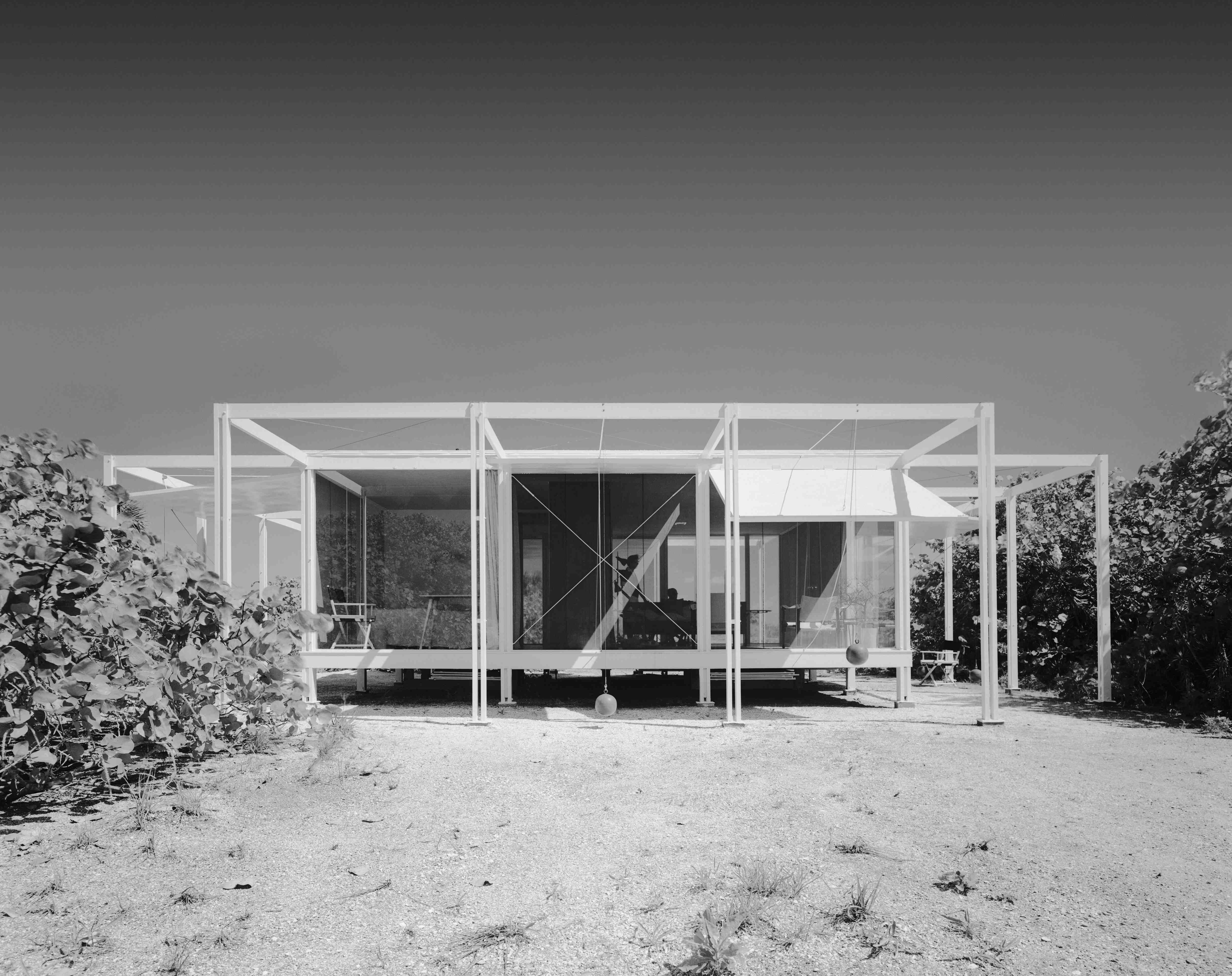


 Jack Priest, her son-in-law, stands in the doorway of the little guesthouse, wearing pink rubber clogs and a marlin-print shirt. He points to a metal escutcheon in the ceiling and explains how one of the pull ropes breaks every so often and has to be replaced and threaded through a hidden pulley, out through a hole in the fascia board. “It takes real concentration,” says Priest, who’s learned how to guide the rope through the openings with a stiff wire.


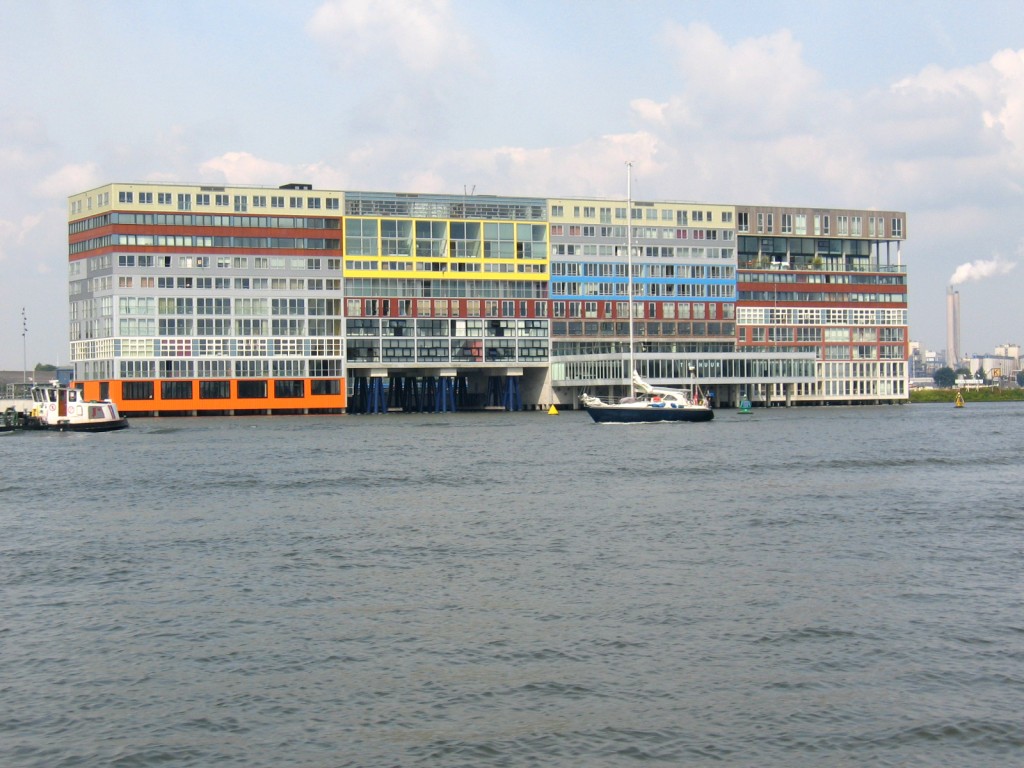


 master plan.


 Apple. The original Seville (1955) was designed by Melvin Grossman, protégé of Morris Lapidus and the new owners want to keep its rat-pack elegance in tact of the original while smoothing and slimming it down to suit a sleeker, more pampered clientele. (Basic room rates start at about $1,000 a night.) The Edition/Seville holds its own against the Fontainebleau and Eden Roc just up Collins and only lacks the kind of money-shot moment that Lapidus was so good at choreographing, but Grossman outdid his mentor when it came to the outdoor circular bar and multi-level diving platform, both of which have been lovingly restored along with the oversized chandeliers and gold mosaic columns in the lobby.


![215_NBW_ch4_037[1A]_master_med](https://alastairgordonwalltowall.com/wp-content/uploads/2014/10/215_nbw_ch4_0371a_master_med.jpg)


 window of the plane banking over city on final approach. It gave
  me a chill: Goth wings reaching up, so-called “Wings of Progress,”in ribbed aluminum, oxidized and black, anchored to ornate grille-work, vaguely sinister like Batman’s Lair, looming over this city that once prospered on wheat and optical equipment. We drive to the studio first, a former soybean mill on Maple Street, built in the 1890s, clad in cedar shingles. When he bought the building in 1968 there were a thousand mice in residence so he got a cat. He also added a porte-cochère, an L-shaped addition and further improvements, as the spirit moved him, until it grew into the 15,000-square-foot hive it is today. Dust-flecked light filters through a window in the big
  studio. Walls are white and floors a pale concrete strewn with wood shavings. Ideas flow freely here. Large drawings are tacked to boards showing future projects, simple outlines drawn in Magic Marker. Benches are covered with chisels and mallets, spoke shaves, small-scale models made from clay or foam, and clamps in every size and shape, hundreds of clamps. There are drill presses, long-bed jointers and a monstrous L. Powers band saw made for building ships. Castle moves about easily, shifting an unfinished piece of furniture, touching one of the hydraulic chisels, and despite the silver hair, he seems like a much younger man, trim and fit from carving and lifting heavy slabs of lumber. He stops and stands for a moment as if about to say something, but then moves on silently. There’s no particular sense of urgency. He employs six full-time
  assistants but continues to carve many of the pieces himself, especially when it’s the first in a series. “It’s important that I stay involved,” he says. “I can make decisions along the way.” He leads me through a series of spaces that unfold like the chambers of a Nautilus shell, dusty and lit from flickering fluorescent tubes, connected by darker passageways, steps or ramps that go up and then down again. How many rooms in all? I make a mental count of twenty-something but suspect there are probably more and at one point feel as if I’m waking through the convoluted synapses of Castle’s own brain. I follow him upstairs through more workshops, a room with a fireplace and billiard table, into yet another studio where assistants are making tables from
  laminated plywood infused with red epoxy. “I’m always thinking as I draw,” says Castle who crouches to open a dusty cabinet.
  (We’ve entered a cramped little office on the upper level.) “My drawing table is like a retreat,” he says. “That’s where it all happens. I draw a little every day and my drawings are the starting point. I would never just start to carve a piece. I come into the studio on Saturday morning and I don’t answer the phone. I just draw. It’s always been that way. The moment of discovery.”

 one of these early experiments as a “mad, branchy piece of wood sculpture designed on the principle of a child’s high chair,” but questioned whether it could be used for actual sitting. There was a coffee table with legs that Castle carved into smokey ligaments reaching around a vermillion slab that hovered on top like a surfboard. A chest of drawers from 1962 rested on six wavering, twig-like legs, two of which extended up to become pull handles


 shell-like desk with cantilevered couch, suggesting new ways to inhabit three-dimensional space. For one client, Castle carved a sleeping platform with elephant-stump legs and a tear-drop desk that looked like a harbor encircled by a ridge of hills. A lamp rose from the far shore of this dreaming machine like a lighthouse beckoning the sleeper back from the edge of unconsciousness. Enclosed Reclining Environment for One was a blob-shaped chamber carved from laminated oak that could be entered through a little Hobbit doorway. The snugly shaped interior was
  padded with foam rubber and upholstered with a natural-colored Flokati rug allowing just enough room to enfold a single person in soul-searching solitude. “When you get inside, it’s almost like being in your mother’s womb,” said one visitor. Another compared it to a “free-form coffin.”
 century manor with a greenhouse at the back and inside, a compilation of rough textures, tufted handmade things, un-curated rooms with early wood pieces by Castle, ceramics by his wife Nancy Jurs, musical instruments and artworks by friends, all cluttered into a living collage. Just after dinner, Castle hauls out a battered old guitar and a handmade ukulele and starts strumming. At times he appears shy and reserved in a Midwestern way, but now falls eagerly into Woody Guthrie’s “Do Re Mi,” then stops to pour us both a whiskey. I pick up the guitar and sing “Helpless,” and am about to slide into something by Dylan when Castle storms into “Hobo’s Lullaby,” followed by Guthrie’s
 classic “So Long, It’s Been Good to Know You,” singing with such passionate intensity that I lean back and just listen, feeling as if I’d drifted into some union gathering of the 1930s. A dust storm hit, an’ it hit like thunder; It dusted us over, an’ it covered us under; Blocked out the traffic an’ blocked out the sun, Straight for home all the people did run…


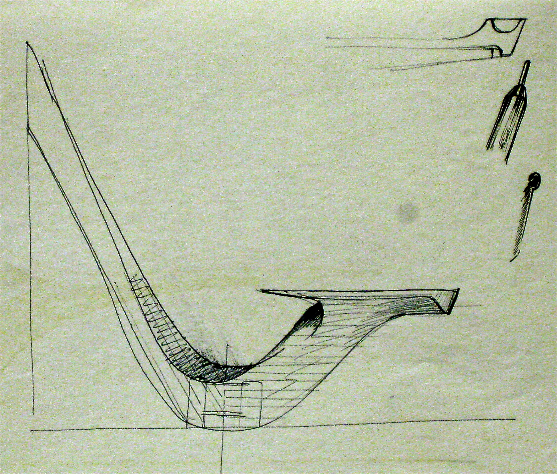